# Grid
# What is CSS Grid?
As flexbox was desgined as a one-dimensional model, CSS Grid Layout is a two-dimensional layout system. So in a grid layout you have two axes available to align things against. It helps you build complex layouts straightforward.
# I heard that CSS Grid is better than Flexbox, is that true?
The short answer is no. Both CSS Grid and Flexbox are a set of tools designed to order and compose elements in a layout, but CSS Grid is centered around the layout and sections of the page itself, while Flexbox is intended to order elements inside a container. They have some things in common, but the ideal scenario is to complement the use of both tools.
# Basic terminology
# Grid container
The element on which display: grid is applied, it’s the direct parent of all the grid items.
In this example container is the grid container.
<!DOCTYPE html>
<div class="container">
  <div class="item item-1"> </div>
  <div class="item item-2"> </div>
  <div class="item item-3"> </div>
</div>
.container {
    display: grid;
}
# Grid item
The children (i.e. direct descendants) of the grid container. Here the item elements are grid items, but sub-item
isn’t.
<!DOCTYPE html>
<div class="container">
  <div class="item"> </div>
  <div class="item">
    <p class="sub-item"> </p>
  </div>
  <div class="item"> </div>
</div>
.container {
    display: grid;
}
# Grid line
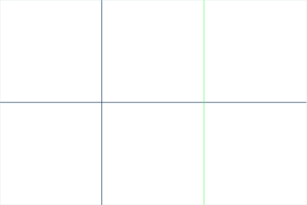
The dividing lines that make up the structure of the grid. They can be either vertical (“column grid lines”) or horizontal (“row grid lines”) and reside on either side of a row or column.
Here the green line is an example of a column grid line.
# Grid cell
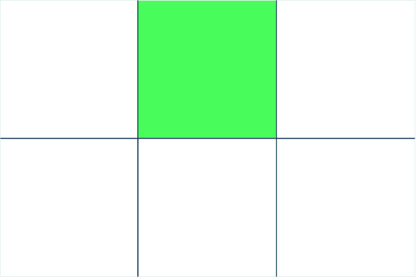
The space between two adjacent row and grid lines. It’s a single “unit” of the grid.
Here’s the grid cell between row grid lines 1 and 2, and column grid lines 2 and 3.
# Grid track
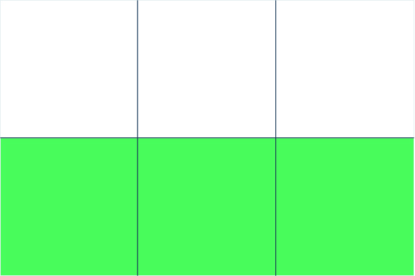
The space between two adjacent grid lines. You can think of them like the columns or rows of the grid.
Here’s the grid track between the second and third row grid lines.
# Grid area
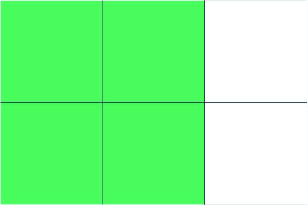
The total space surrounded by four grid lines. A grid area may be composed of any number of grid cells.
Here’s the grid area between row grid lines 1 and 3, and column grid lines 1 and 3.
# CSS grid properties
# display
Defines the element as a grid container and establishes a new grid formatting context for its contents.
# Values:
grid– generates a block-level gridinline-grid– generates an inline-level grid
# grid-template-columns grid-template-rows
Defines the columns and rows of the grid with a space-separated list of values. The values represent the track size, and the space between them represents the grid line.
# Values:
<track-size>– can be a length, a percentage, or a fraction of the free space in the grid (using the fr unit)<line-name>– an arbitrary name of your choosing
# Examples:
When you leave an empty space between the track values, the grid lines are automatically assigned positive and negative numbers:
.container {
  grid-template-columns: 40px 50px auto 50px 40px;
  grid-template-rows: 25% 100px auto;
}
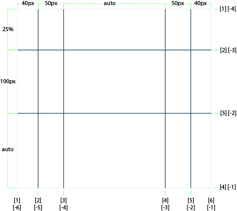
Nevertheless, grid lines can be manually assigned a name wrapping it on square brackets between the track sizes:
.container {
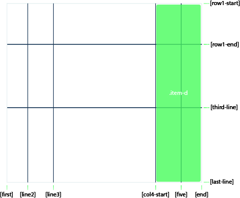
    grid-template-columns: [first] 40px [line2] 50px [line3] auto [col4-start] 50px [five] 40px [end];
    grid-template-rows: [row1-start] 25% [row1-end] 100px [third-line] auto [last-line];
}
The grid lines can also have multiple names, the syntax to do this is just separate the various names inside the square brackets with a space.
In the following example the second column line can be referenced as col-1-end or col-2-start (see
grid-column-start grid-column-end grid-row-start grid-row-start)
.container {
    grid-template-columns: [col-1-start] 50px [col-1-end col-2-start] 50px [col-2-end] 50px;
}
# fr the new magical measure unit
fr is a new measure unit introduces by and exclusively for CSS grid.
Each fr size is the result of taking all the remaining space in the container and dividing it by the number of fr
instances in the grid-template. One important thing to understand about the fr measure unit is that is calculated
after all the fixated measure units on the template.
# Examples:
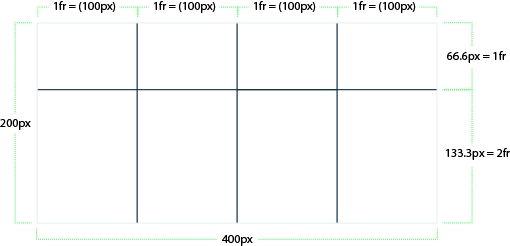
In the following example we have a container that is 200px tall and 400px wide, with 4 columns and 3 rows made with
the fr measure unit, resulting in columns of 100px (400px / 4), one row of 66.6px (200px / 3) and one of 133.3px
((200px / 3) * 2):
.container {
    width: 400px;
    height: 200px;
    display: grid;
    grid-template-columns: 1fr 1fr 1fr 1fr;
    grid-template-rows: 1fr 2fr;
}
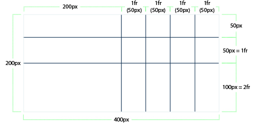
The following example is similar as the previous one, with the difference that now we have one fixated row and column,
resulting on different fr sizes, due to the fact that those sizes are calculated after all the fixated ones:
.container {
    width: 400px;
    height: 200px;
    display: grid;
    grid-template-columns: 200px 1fr 1fr 1fr 1fr;
    grid-template-rows: 50px 1fr 2fr;
}
# Make it less redundant with repeat()
If your definition contains repeating parts, you can use the repeat() notation to streamline things:
.container {
    grid-template-columns: repeat(3, 200px [col-start]);
}
Which is equivalent to:
.container {
    grid-template-columns: 200px [col-start] 200px [col-start] 200px [col-start];
}
Note that in this case we have three grid lines with the same name, is this a problem? How do i reference diferent lines with the same name?
CSS Grid gives us a simple solution to this problem, letting us reference a grid line with the name and count, the following item column track will start in the second grid line and end on the third one:
.item {
    grid-column-start: col-start 2;
    grid-column-end: col-start 3;
}
# column-gap row-gap grid-column-gap grid-row-gap
This properties define the spacing between the grid cells of a column and a row respectively.
# Values:
<line-size>– a length value
# Example:
.container {
  grid-template-columns: 100px 50px 100px;
  grid-template-rows: 80px auto 80px;
  column-gap: 10px;
  row-gap: 15px;
}
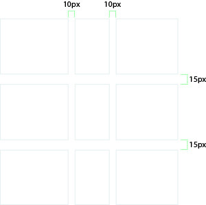
The gutters are only created between the columns/rows, not on the outer edges.
Note: The grid- prefix will be removed and grid-column-gap and grid-row-gap renamed to column-gap and row-gap. The unprefixed properties are already supported in Chrome 68+, Safari 11.2 Release 50+ and Opera 54+.
# gap grid-gap
A shorthand for row-gap and column-gap
# Values:
<grid-row-gap><grid-column-gap>– length values
# Example:
.container {
  grid-template-columns: 100px 50px 100px;
  grid-template-rows: 80px auto 80px;
  gap: 15px 10px;
}
If no row-gap is specified, it’s set to the same value as column-gap
Note: The grid- prefix will be removed and grid-gap will be renamed to gap. The unprefixed properties are already supported in Chrome 68+, Safari 11.2 Release 50+ and Opera 54+.
# grid-template-areas
Defines a grid template by referencing the names of the grid areas which are specified with the grid-area property. Repeating the name of a grid area causes the content to span those cells. A period signifies an empty cell. The syntax itself provides a visualization of the structure of the grid.
# Values:
<grid-area-name>– the name of a grid area specified with grid-area.– a period signifies an empty grid cellnone– no grid areas are defined
# Example:
.item-a {
  grid-area: header;
}
.item-b {
  grid-area: main;
}
.item-c {
  grid-area: sidebar;
}
.item-d {
  grid-area: footer;
}

.container {
  display: grid;
  grid-template-columns: 50px 50px 50px 50px;
  grid-template-rows: auto;
  grid-template-areas:
    "header header header header"
    "main main . sidebar"
    "footer footer footer footer";
}
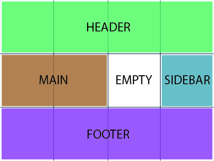
Each row in your declaration needs to have the same number of cells.
You can use any number of adjacent periods to declare a single empty cell. As long as the periods have no spaces between them they represent a single cell.
Notice that you’re not naming lines with this syntax, just areas. When you use this syntax the lines on either end of the areas are actually getting named automatically. If the name of your grid area is foo, the name of the area’s starting row line and starting column line will be foo-start, and the name of its last row line and last column line will be foo-end. This means that some lines might have multiple names, such as the far left line in the above example, which will have three names: header-start, main-start, and footer-start.
# justify-items
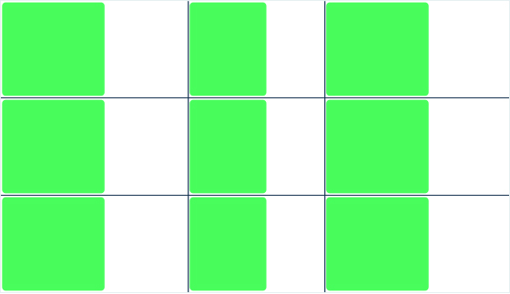
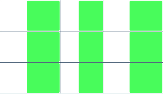
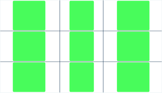
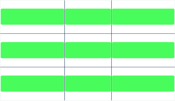
Aligns grid items along the inline (row) axis (as opposed to align-items which aligns along the block (column) axis). This value applies to all grid items inside the container.
# Values:
start– aligns items to be flush with the start edge of their cellend– aligns items to be flush with the end edge of their cellcenter– aligns items in the center of their cellstretch– fills the whole width of the cell (this is the default)
# Examples:
.container {
  justify-items: start;
}
.container {
  justify-items: end;
}
.container {
  justify-items: center;
}
.container {
  justify-items: stretch;
}
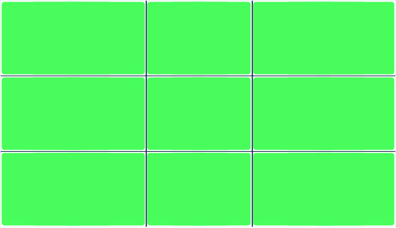
This behavior can also be set on individual grid items via the justify-self property.
# align-items
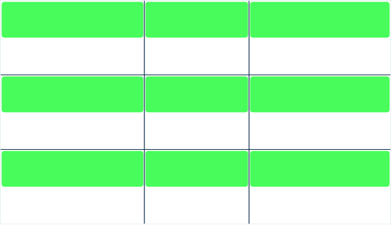
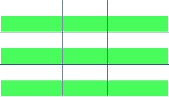
Aligns grid items along the block (column) axis (as opposed to justify-items which aligns along the inline (row) axis). This value applies to all grid items inside the container.
# Values:
start– aligns items to be flush with the start edge of their cellend– aligns items to be flush with the end edge of their cellcenter– aligns items in the center of their cellstretch– fills the whole height of the cell (this is the default)
# Examples:
.container {
  align-items: start;
}
.container {
  align-items: end;
}
.container {
  align-items: center;
}
.container {
  align-items: stretch;
}

This behavior can also be set on individual grid items via the align-self property.
# place-items
place-items sets both the align-items and justify-items properties in a single declaration.
# Values:
<align-items>/<justify-items>– The first value sets align-items, the second value justify-items. If the second value is omitted, the first value is assigned to both properties.
All major browsers except Edge support the place-items shorthand property.
# justify-content
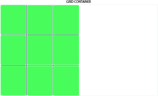
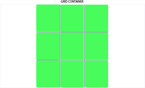
Sometimes the total size of your grid might be less than the size of its grid container. This could happen if all of your grid items are sized with non-flexible units like px. In this case you can set the alignment of the grid within the grid container. This property aligns the grid along the inline (row) axis (as opposed to align-content which aligns the grid along the block (column) axis).
# Values:
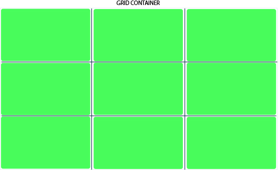
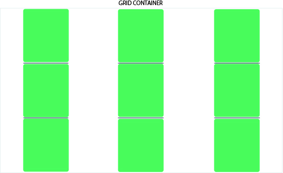
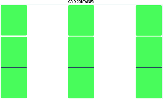
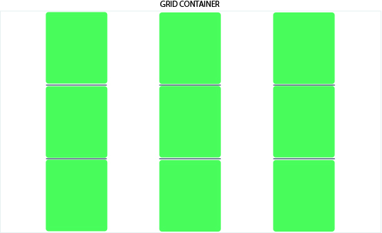
start– aligns the grid to be flush with the start edge of the grid containerend– aligns the grid to be flush with the end edge of the grid containercenter– aligns the grid in the center of the grid containerstretch– resizes the grid items to allow the grid to fill the full width of the grid containerspace-around– places an even amount of space between each grid item, with half-sized spaces on the far endsspace-between– places an even amount of space between each grid item, with no space at the far endsspace-evenly– places an even amount of space between each grid item, including the far ends
# Examples:
.container {
  justify-content: start;
}
.container {
  justify-content: end;
}
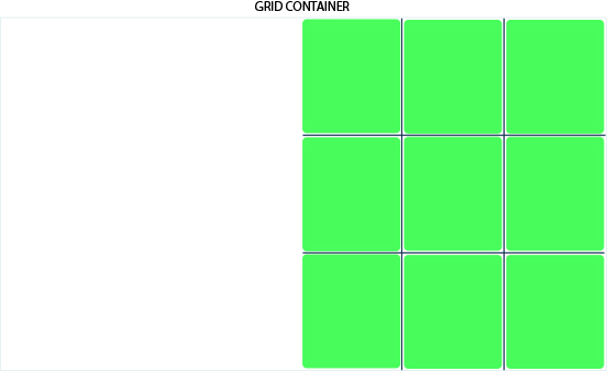
.container {
  justify-content: center;
}
.container {
  justify-content: stretch;
}
.container {
  justify-content: space-around;
}
.container {
  justify-content: space-between;
}
.container {
  justify-content: space-evenly;
}
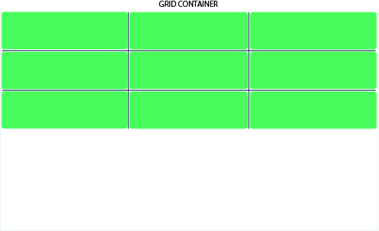
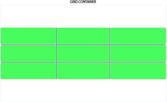
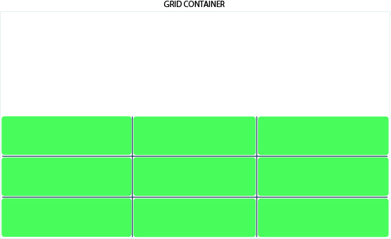
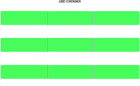
# align-content
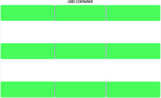
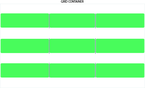
Sometimes the total size of your grid might be less than the size of its grid container. This could happen if all of your grid items are sized with non-flexible units like px. In this case you can set the alignment of the grid within the grid container. This property aligns the grid along the block (column) axis (as opposed to justify-content which aligns the grid along the inline (row) axis).
# Values:
start– aligns the grid to be flush with the start edge of the grid containerend– aligns the grid to be flush with the end edge of the grid containercenter– aligns the grid in the center of the grid containerstretch– resizes the grid items to allow the grid to fill the full height of the grid containerspace-around– places an even amount of space between each grid item, with half-sized spaces on the far endsspace-between– places an even amount of space between each grid item, with no space at the far endsspace-evenly– places an even amount of space between each grid item, including the far ends
# Examples:
.container {
  align-content: start;
}
.container {
  align-content: end;
}
.container {
  align-content: center;
}
.container {
  align-content: stretch;
}

.container {
  align-content: space-around;
}
.container {
  align-content: space-between;
}
.container {
  align-content: space-evenly;
}
# place-content
place-content sets both the align-content and justify-content properties in a single declaration.
# Values:
<align-content>/<justify-content>– The first value sets align-content, the second value justify-content. If the second value is omitted, the first value is assigned to both properties. All major browsers except Edge support the place-content shorthand property.
For more details, see align-content and justify-content.
# grid-auto-columns grid-auto-rows
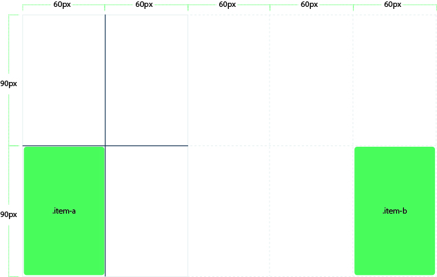
Specifies the size of any auto-generated grid tracks (aka implicit grid tracks). Implicit tracks get created when there are more grid items than cells in the grid or when a grid item is placed outside of the explicit grid. See the difference between Explicit and Implicit grids (opens new window)
# Values:
<track-size>– can be a length, a percentage, or a fraction of the free space in the grid (using the fr unit)
To illustrate how implicit grid tracks get created, think about this:
.container {
  grid-template-columns: 60px 60px;
  grid-template-rows: 90px 90px;
}
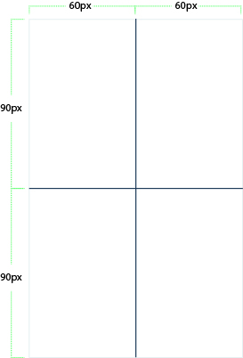
This creates a 2 x 2 grid.
But now imagine you use grid-column and grid-row to position your grid items like this:
.item-a {
  grid-column: 1 / 2;
  grid-row: 2 / 3;
}
.item-b {
  grid-column: 5 / 6;
  grid-row: 2 / 3;
}
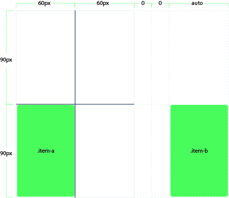
We told .item-b to start on column line 5 and end at column line 6, but we never defined a column line 5 or 6.
Because we referenced lines that don’t exist, implicit tracks with widths of 0 are created to fill in the gaps.
We can use grid-auto-columns and grid-auto-rows to specify the widths of these implicit tracks:
.container {
  grid-auto-columns: 60px;
}
# grid-auto-flow
If you have grid items that you don’t explicitly place on the grid, the auto-placement algorithm kicks in to automatically place the items. This property controls how the auto-placement algorithm works.
# Values:
row– tells the auto-placement algorithm to fill in each row in turn, adding new rows as necessary (default)column– tells the auto-placement algorithm to fill in each column in turn, adding new columns as necessarydense– tells the auto-placement algorithm to attempt to fill in holes earlier in the grid if smaller items come up later
Note that dense only changes the visual order of your items and might cause them to appear out of order, which is bad for accessibility.
# Examples:
Consider this HTML:
<section class="container">
  <div class="item-a">item-a</div>
  <div class="item-b">item-b</div>
  <div class="item-c">item-c</div>
  <div class="item-d">item-d</div>
  <div class="item-e">item-e</div>
</section>
You define a grid with five columns and two rows, and set grid-auto-flow to row (which is also the default):
.container {
  display: grid;
  grid-template-columns: 60px 60px 60px 60px 60px;
  grid-template-rows: 30px 30px;
  grid-auto-flow: row;
}
When placing the items on the grid, you only specify spots for two of them:
.item-a {
  grid-column: 1;
  grid-row: 1 / 3;
}
.item-e {
  grid-column: 5;
  grid-row: 1 / 3;
}
Because we set grid-auto-flow to row, our grid will look like this.
Notice how the three items we didn’t place (item-b, item-c and item-d) flow across the available rows:

If we instead set grid-auto-flow to column, item-b, item-c and item-d flow down the columns:
.container {
  display: grid;
  grid-template-columns: 60px 60px 60px 60px 60px;
  grid-template-rows: 30px 30px;
  grid-auto-flow: column;
}

# grid-column-start grid-column-end grid-row-start grid-row-end
Determines a grid item’s location within the grid by referring to specific grid lines. grid-column-start/grid-row-start is the line where the item begins, and grid-column-end/grid-row-end is the line where the item ends.
# Values:
<line>– can be a number to refer to a numbered grid line, or a name to refer to a named grid linespan <number>– the item will span across the provided number of grid tracksspan <name>– the item will span across until it hits the next line with the provided nameauto– indicates auto-placement, an automatic span, or a default span of one
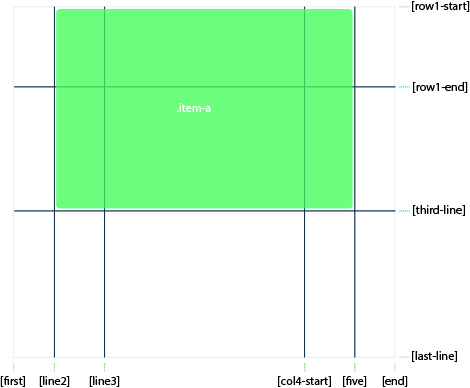
.item-b {
  grid-column-start: 1;
  grid-column-end: span col4-start;
  grid-row-start: 2;
  grid-row-end: span 2;
}
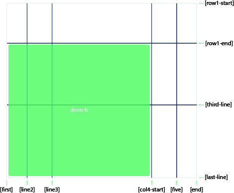
If no grid-column-end/grid-row-end is declared, the item will span 1 track by default.
Items can overlap each other. You can use z-index to control their stacking order.
# grid-column grid-row
Shorthand for grid-column-start + grid-column-end, and grid-row-start + grid-row-end, respectively.
# Values:
<start-line>/<end-line>– each one accepts all the same values as the longhand version, including span
Example:
.item-c {
  grid-column: 3 / span 2;
  grid-row: third-line / 4;
}
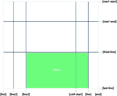
If no end line value is declared, the item will span 1 track by default.
# grid-area
Gives an item a name so that it can be referenced by a template created with the grid-template-areas property. Alternatively, this property can be used as an even shorter shorthand for grid-row-start + grid-column-start + grid-row-end + grid-column-end.
# Values:
<name>– a name of your choosing<row-start>/<column-start>/<row-end>/<column-end>– can be numbers or named lines
# Examples:
As a way to assign a name to the item:
.item-d {
  grid-area: header;
}
As the short-shorthand for grid-row-start + grid-column-start + grid-row-end + grid-column-end:
.item-d {
  grid-area: 1 / col4-start / last-line / 6;
}
# justify-self
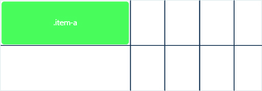
Aligns a grid item inside a cell along the inline (row) axis (as opposed to align-self which aligns along the block (column) axis). This value applies to a grid item inside a single cell.
# Values:
start– aligns the grid item to be flush with the start edge of the cellend– aligns the grid item to be flush with the end edge of the cellcenter– aligns the grid item in the center of the cellstretch– fills the whole width of the cell (this is the default)
# Examples:
.item-a {
  justify-self: start;
}
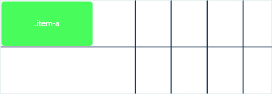
.item-a {
  justify-self: end;
}
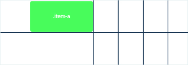
.item-a {
  justify-self: center;
}
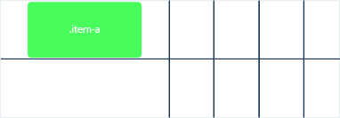
.item-a {
  justify-self: stretch;
}
# align-self
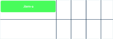
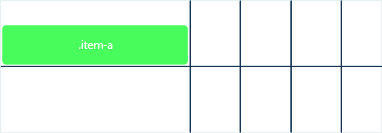
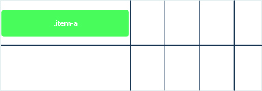
Aligns a grid item inside a cell along the block (column) axis (as opposed to justify-self which aligns along the inline (row) axis). This value applies to the content inside a single grid item.
# Values:
start– aligns the grid item to be flush with the start edge of the cellend– aligns the grid item to be flush with the end edge of the cellcenter– aligns the grid item in the center of the cellstretch– fills the whole height of the cell (this is the default)
# Examples:
.item-a {
  align-self: start;
}
.item-a {
  align-self: end;
}
.item-a {
  align-self: center;
}
.item-a {
  align-self: stretch;
}

To align all the items in a grid, this behavior can also be set on the grid container via the align-items property.
# ´place-self´
place-self sets both the align-self and justify-self properties in a single declaration.
# Values:
auto– The “default” alignment for the layout mode.<align-self>/<justify-self>– The first value sets align-self, the second value justify-self. If the second value is omitted, the first value is assigned to both properties.
# Examples:
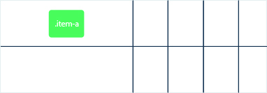
.item-a {
  place-self: center;
}
.item-a {
  place-self: center stretch;
}

All major browsers except Edge support the place-self shorthand property.
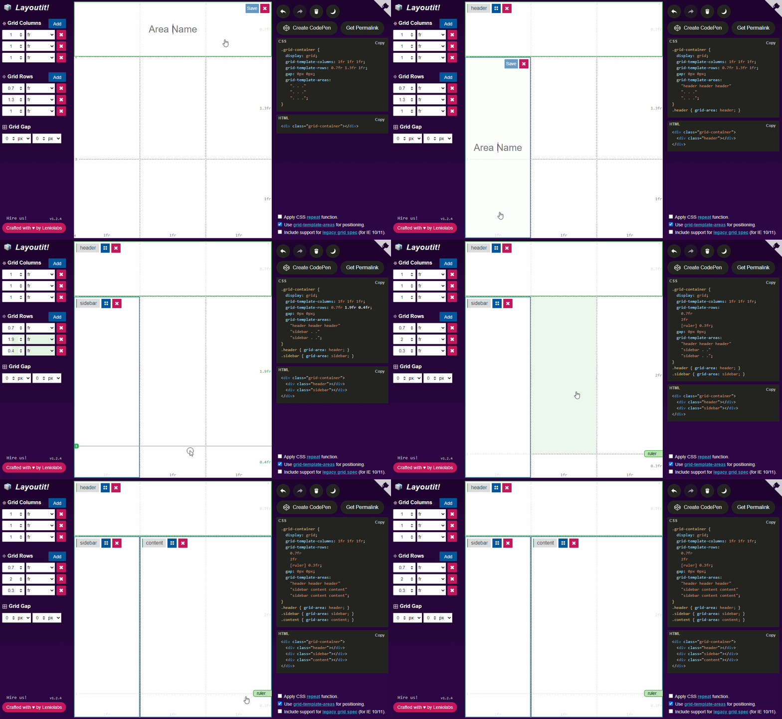
# Layoutit!
Learn CSS Grid in a simple and easy way with our magic tool Layoutit (opens new window)
